Responsive Website Development
Responsiveness describes the functionality of the design and structure of your website. If your site is responsive, it is going to change according to the device screen size and resolution. When I build I think about that aspect a lot. Media Queries, structuring data out with div’s, layout on a computer or on a small screen size. I love it.
By taking a look at the pictures I have here you can see the differences as the screen changes along with the device size. Hell if you minimize up in the upper right hand corner then drag your browser to a slimmer width you will see for your self how it changes. Very cool.
I have been doing responsive design for years. Media Queries are a clean and simple way to create exactly the look and feel you need for a truly great user experience. It’s all about clean up the look, ditching what you do not need and keeping the content lean, we need it to load quickly.
The following is an article I wrote about this subject about 3 years ago. I have come very far since then, but everything I state there is still the truth.
Our Responsive sites start at $899 – Contact Us Today – jeremygradisher@gmail.com
Responsive Web Development Examples:
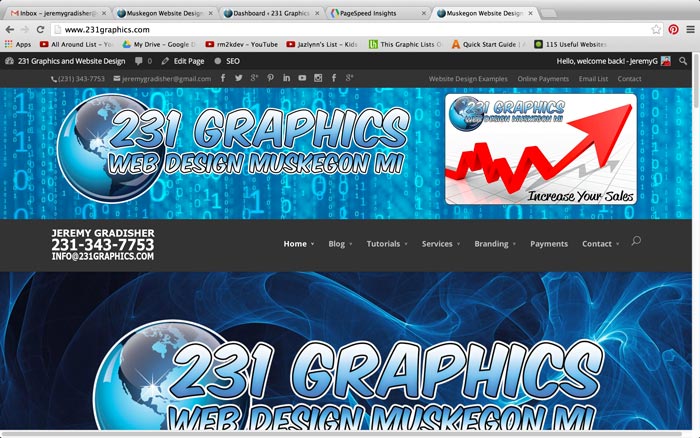
Responsive Website Design by 231 Graphics:

With a combination of HTML5 and CSS3 we have been introduced to something very cool, responsive websites. What is a responsive website? It is a site that changes the way it looks, and the way it serves information according to your browser size, meaning, if done right, it will still look good whether you are looking at it on a desktop, a laptop, a tablet or a mobile device. Truth is for years now I have utilized a piece of PHP code that identified the type of browser you where using, and if you where using a mobile device, I would actually serve up a separate set of pages. With responsive websites that is no more. As you can see with the two pics that are on this page, there is one way the site looks when it is full sized, as if it where being served on a full sized desktop.
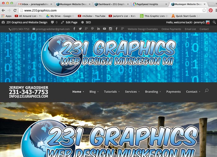
Then the second pic down is the same exact page, being served on a mobile device – (A HTC Android Phone). The way I pull this off is with media queries, through CSS3, very fun to do really. A bunch of little css code to make things change according to the dimensions of the areas that they are displayed in, as well as a whole lot more.  On this page I here I also used a piece of Javascript called FancyBox so if you click on the picks to the left you can see a very nice looking blown up picture of the screenshots. Responsive sites are truly the forefront of the web development industry, and something I am going to push pretty hard as a selling point.
If you would like to view one in action please see www.rivervalleydevelopment.com. This was my first public stab at making this type of coding work. All HTML5, overall it validates, and overall it looks really great. Truth is though this is only the beginning. I’ve two more sites that I am building right now that are going to blow the doors off of this type of design, and this type of coding. Just wait and see. Responsive websites by 231 Graphics start at $1000.00. Come and get ’em fast because you know that price is going up, as there is no one else around this area that can pull it off!!!!