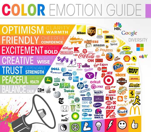
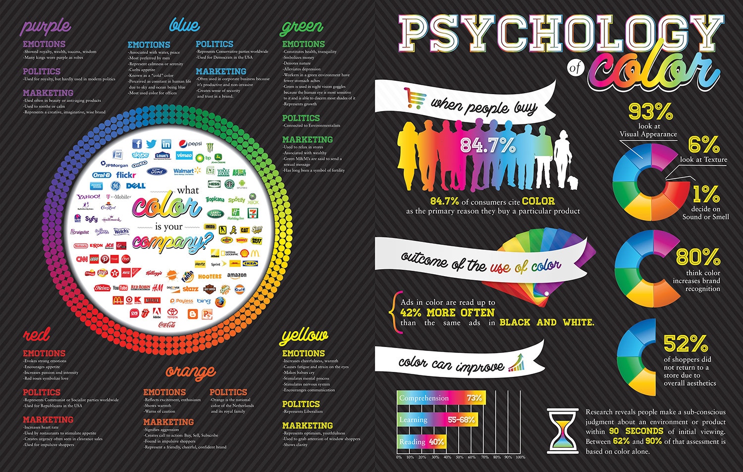
Psychology of Color
What you choose may say more than you think.
I had always associated red with a stoplight or a stop sign. I thought I don’t want them to stop, I want them to click the button. Red is powerful and eye catching. It screams excitement. Truth is red call to actions are a very smart play. Especially with a lighter minimal style background such as what I have on this site. A red call to action would really work well here.
See what I did there?
Grabbing your viewer’s attention is easy.
What is your story?
I talk about that a lot. I feel like good marketing is telling a story. Your color lays down a vibe, an emotion. What does your color say about you? Are you wanting to come of as cool and confident? Maybe wise and/or trustworthy. Are you representing an aggressive in your face vibe? Take the color green. You will call a company green meaning that they are environmentally healthy, good for the environment. That is powerful.
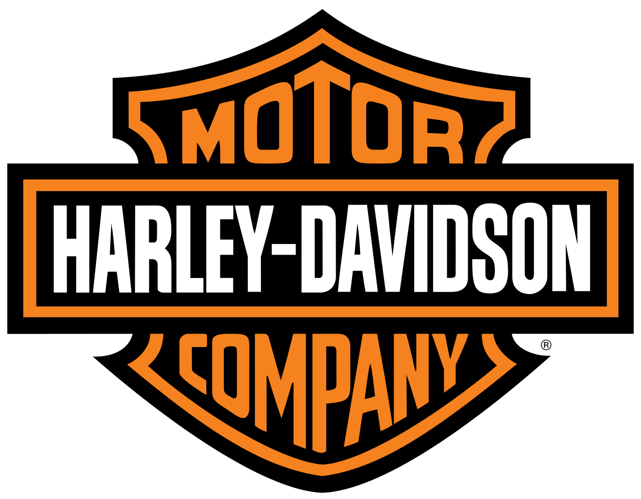
Harley Davidson Logo
Maybe one of the boldest and certainly one of the coolest branded companies on the planet. Harley-Davidson is killing it with the orange and black. The contrast is perfect. Their logo is bold and aggressive while at the same time being cool and confident. I would certainly call it one of the best brands in the world.
![]()
![]()
The Honest Company
The Honest Company has come out of nowhere and become quite a powerhouse. Blue is known for being about productive and non-invasive. There is a certain cleanliness and security. If you do not know this is Jessica Alba’s company that does eco-friendly baby diapers, wipes, bath & body care. That blue and that logo is literally perfect for what they are selling.

231 Web Development Logo Design
I think my logo has come a long way. It was just some graphic globe that I found somewhere years ago when I needed something for 231 Graphics. I ended up making some custom changes to it in the long run. I have always went with blue. I use a lighter blue for the highlights and use a very cool and bold darker blue. I feel like it is trustworthy, productive and creative. I have got some good contrast going.
work.shopMG Logo
![]()
![]()
Using a Complimentary Color for Highlights
As you can see, this blue and orange are opposites on the color wheel
Which means they will work together!
…
…
All of these colors work together, I use them throughout this website:
231 Light Blue: #2ea3f2
231 Branded Blue: #151c9f
work.shop orange: #f15b28
Dead Eye Creative Red: #ab040b
Complimentary Green: #00a531