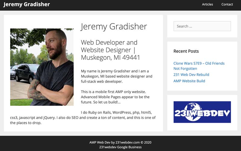
I have always struggled with where I think is the best place to put the content that I create. I have had jeremygradisher.com for as long as I can remember and I have never put any real sort of content on it.
I have a tendency to roll through and rebuild it over and over again. I’ve simply used it as a test site really. Whatever new set of themes I am deciding to use, I roll through and do it to this site and see what happens.
I really want to get back to content creation and taking a stab at generating traffic. I’ve done it before on just random articles I have written. I have a post about military vector logos that generates a hell of a lot of traffic.
Web design basics
Instead of doing some crazy over the top deal for my name site, this time I chose to intentionally be as minimal as possible and then to let the content speak for itself. I use no highlight colors here. This is black and white and gray.
This is the most basic idea. The calm before the storm of what’s to come. That front room that’s moderately bare because you just moved in. That new car smell. I have it all here.
Adsense ad additions
Down the road I am going to ad some adsense ads here. I have to build up the content first on the site to be able to make that happen. I am seeing some complications from the AMP only ads not being real compatible with the desktop version of the site, but I do assume sooner or later that I am going to figure a way to overcome that challenge.
Take a look at jeremygradisher.com