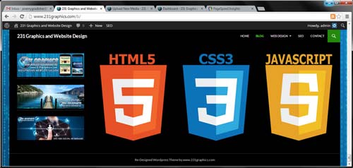
231 Graphics New Blog features Responsive HTML5, CSS3, PHP and Javascript
A couple of months back I went through the 231 Graphics site and did a full on re-design to accommodate all of the different devices such as desktops, laptops, tablets and smartphones. Web developers nowadays have to think clearly about the way their sites will look no matter what the screen resolution or aspect ratio.
This new type of design called “Responsive Website Design” is capable through a combination of HTML5 and CSS3 media queries and is the forefront of our industry. I needed to apply this technique to the blog area of www.231graphics.com as when I made the changeover the blog was still non-responsive.
The WordPress Re-Boot…
For the blog area of my site I have always used what I consider to be my favorite content management system WordPress. The rest of 231 Graphic’s site is a dynamically built HTML5/CSS3 and PHP site with a little Javascript. I built the site, and hand coded everything from the ground up. I love adding a CMS to a site like that for many different reasons. It opens up possibilities. From blogging to shopping carts and more it adds so many options and makes everything about the situation super fun.
For this project I used the WordPress free base build Twenty Fourteen. It’s fully responsive out of the box and overall looks great. There where some CSS changes that I made right off the bat such as centering the overall div and text-aligning all widget text to the middle to accommodate the way things looked in a couple of different situations. I of course also had to change some colors and add a ton of visual graphics, but beyond that it really is the way it came.
Responsiveness and SEO, Do They Go Hand in Hand?
I started to think about this idea a while back. I have always been big into Search Engine Optimization. It’s one of my specialties. I have always known that WordPress is a monster with SEO when used correctly. Over time I have seen that you will get different SERPs depending on if you are searching on a desktop or a mobile phone. Recently I have really been experimenting with that situation to see how I can effect my traffic. It does appear to me that Google especially favors the SERPs on mobile devices for mobile optimized websites. It makes sense really, it gives the users the best experience.
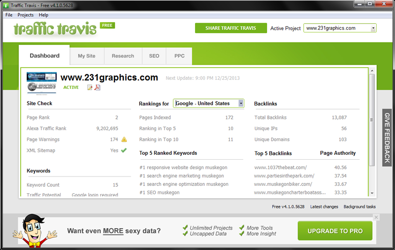
I really use the blog area of 231 Graphics for a few different situations. Of course I like to spotlight and show off the work I am doing, but it’s bigger than that. To succeed with SEO you need to be adding fresh and relevant content on a regular basis. Even beyond that you can use it to pass link juice. It comes in handy for so many situations. Lately I have really been experimenting to see how I can effect my rankings with mobile optimized websites, as well as seeing how getting a faster page speed really effects your rankings in the SERPs. We will see…